Here, we present to you our visual identity guidelines on how to create and maintain our brand identity, across all aspects of the business. We want to inspire, all the while increasing recognition and consistency of the corporate Dorel Juvenile brand.
Below you will find how we describe the visual identity that reinforces our entire brand, from the promises we make to the purposes we serve and the stories we tell.
This is how we represent ourselves and communicate visually.


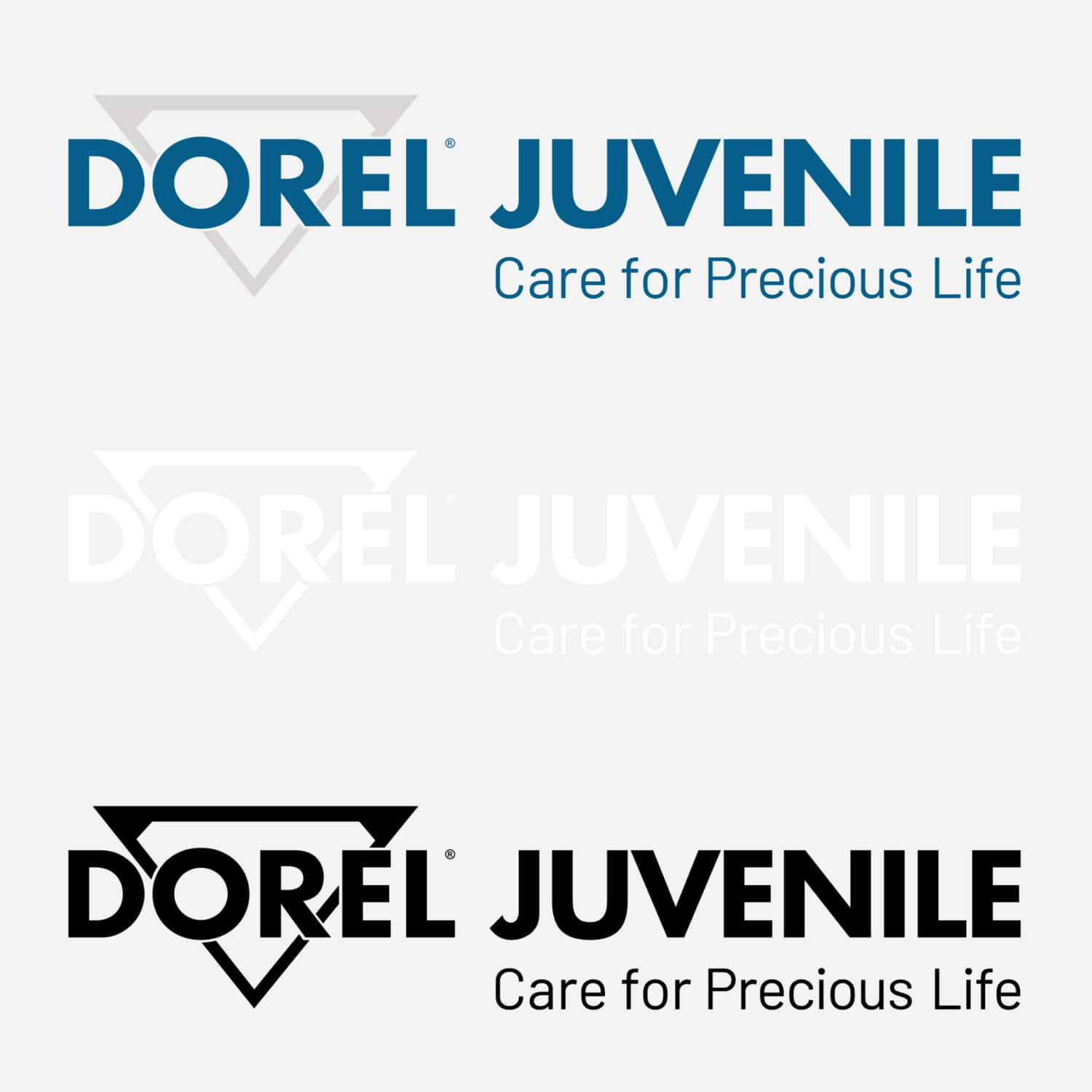
The logo is a visual device that combines our tagline, the signature diamond graphic, and the company name.
You can download our logo (Color, B&W, SVG) below:
Usage
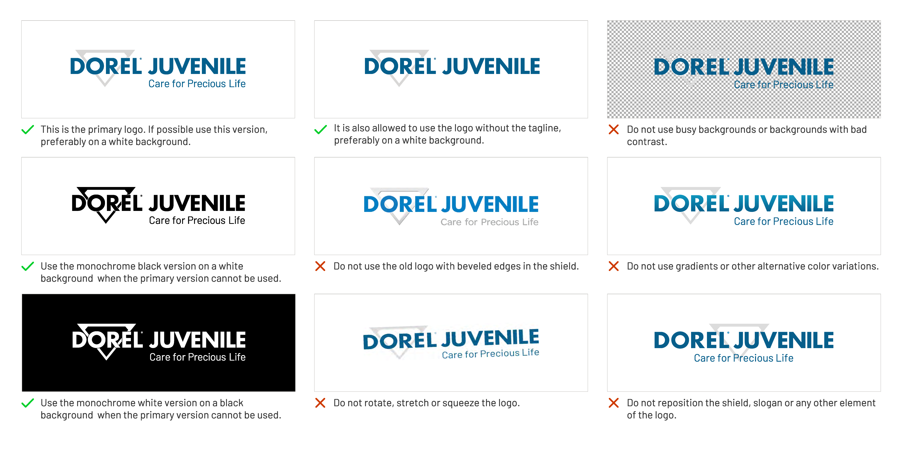
Below you will find details on how to use the Dorel Juvenile logo in your communications:
Use 50% of the diamond’s height to determine margin on the vertical axis.
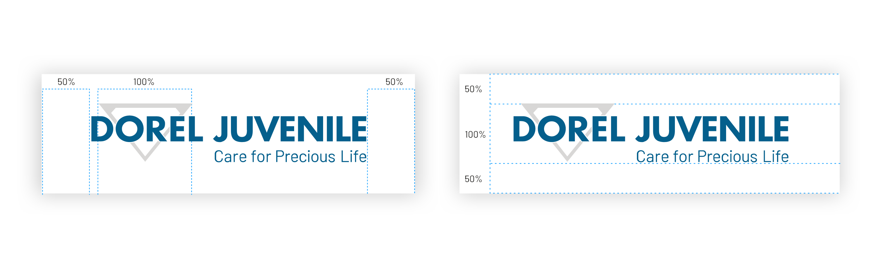
Use 50% of the diamond’s width to determine spacing on the horizontal axis.
Do’s and don’ts
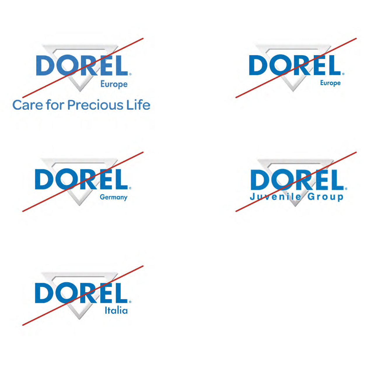
Illegitimate applications
The Dorel logos that were previously used (e.g. Dorel Europe, Dorel Germany, Dorel Juvenile Group), may no longer be used. It is only allowed to use the Dorel Juvenile logo as described in this document.
Exception: Legal entities
In all formal and/or legal communication where it is required to use the name with which the local legal entity is registered (e.g. invoices, contracts), you are still allowed to use the logos previously mentioned.
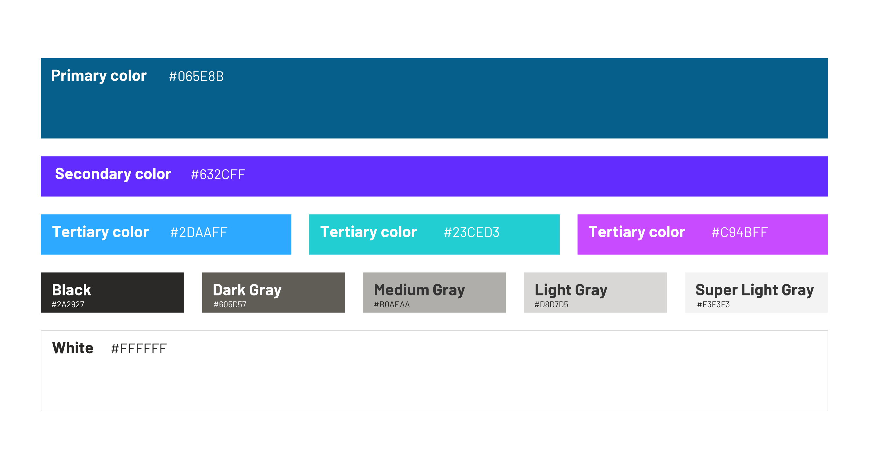
Color: palette
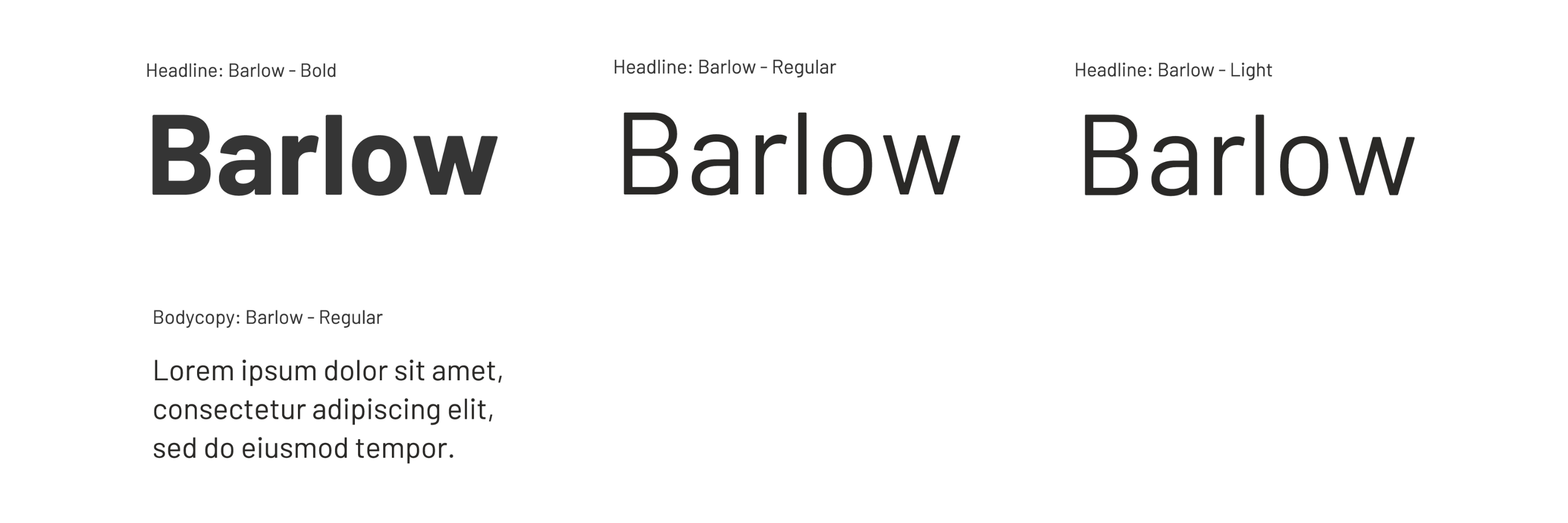
Our typography
Dorel Juvenile uses Barlow in all visual communication for both Headlines and Body copy. The usage is limited to the following font weights: ‘Bold, Light, and Regular’.
Barlow is a free Google font and can be downloaded here. In the case Barlow is not available, you can use the standard Windows system font Calibri as a replacement font.